
.png)
Curves in R-Programming Language
In R programming, curves are essential for visualizing relationships between variables or functions.
There are several types of curves, from basic function plots to more advanced ones. Below are various types of curves that can be created in R, along with examples and use cases.
1. Basic Function Curves (curve() function)
- Description: The curve() function in R is used to plot mathematical expressions or functions over a specified interval.
R Code Example:
# Plot a simple curve: y = x^2
curve(x^2, from = -10, to = 10, col = “blue”, main = “Plot of y = x^2”)
Interpretation:
- This code will plot the function y=x^2, creating a parabolic The from and to parameters define the range of x values.
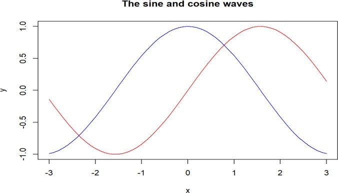
2. Sine and Cosine Curves
- Description: Sine and cosine curves are useful for representing periodic data, such as waves or oscillations.
R Code Example:
# Plot sine and cosine curves
curve(sin(x), from = -2*pi, to = 2*pi, col = “red”, main = “Sine and Cosine Curves”)
curve(cos(x), from = -2*pi, to = 2*pi, col = “blue”, add = TRUE)
legend(“topright”, legend = c(“sin(x)”, “cos(x)”), col = c(“red”, “blue”), lwd = 2)
Interpretation:
- This plot overlays sine and cosine functions on the same graph over the interval [−2π,2π]. The curves represent wave-like oscillations.
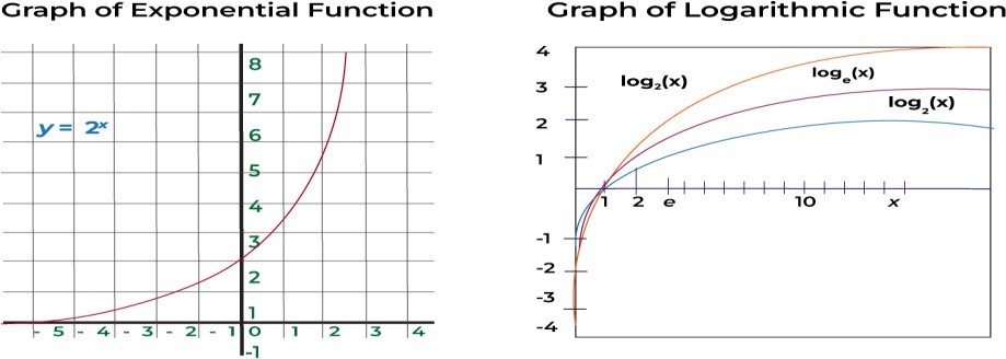
3. Logarithmic and Exponential Curves
- Description: Logarithmic and exponential curves are common in modeling growth processes, such as population growth or radioactive decay.
R Code Example:
# Plot exponential and logarithmic functions par(mfrow = c(1, 2)) # To create two subplots
# Exponential function
curve(exp(x), from = -2, to = 2, col = “green”, main = “Exponential Curve y = exp(x)”)
# Logarithmic function curve(log(x), from = 0.1, to = 10, col = “purple”, main = “Logarithmic Curve y = log(x)”)
Interpretation:
- Exponential curve: y=exy=ex rises rapidly for positive x values and approaches zero for negative values.
- Logarithmic curve: y=log(x)y=log(x) rises slowly for large values of x but rapidly for small
4. Polynomial Curves
- Description: Polynomial curves represent higher-order functions, useful for modeling complex relationships.
R Code Example:
# Plot a cubic function
curve(x^3 – 6*x^2 + 4*x + 12, from = -10, to = 10, col = “orange”, main = “Cubic Function”)
Interpretation:
- A cubic function is plotted with turning points and complex behaviors, often used in advanced regression models or physics.

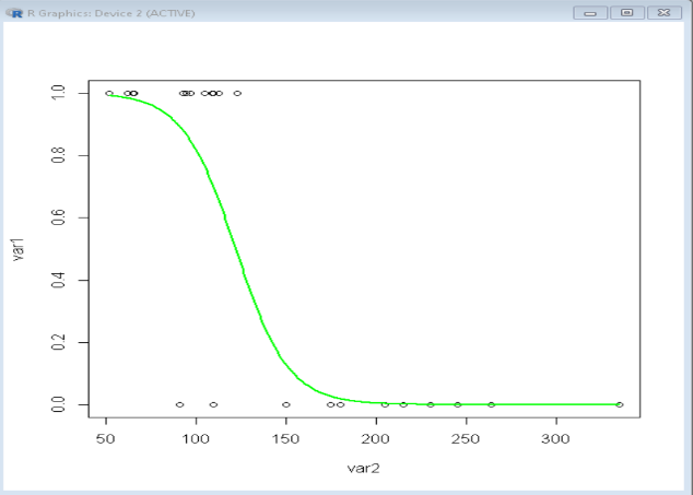
5. Logistic Curve
- Description: Logistic curves are often used in growth models, such as population growth with a carrying capacity.
R Code Example:
# Logistic function plot
logistic <- function(x) {
1 / (1 + exp(-x))
}
curve(logistic(x), from = -10, to = 10, col = “brown”, main = “Logistic Function”)
Interpretation:
- The logistic curve approaches 0 for large negative values and approaches 1 for large positive values, representing an S-shaped (sigmoidal) growth model.
6. Parametric Curves
- Description: Parametric curves involve expressing x and y as functions of a third variable, usually denoted as t.
R Code Example:
# Parametric curve example: Circle
t <- seq(0, 2*pi, length.out = 100)
x <- cos(t)
y <- sin(t)
plot(x, y, type = “l”, col = “blue”, main = “Parametric Circle”, xlab = “x”, ylab = “y”)
Interpretation:
- The above code plots a parametric circle where x = cos(t) and y = sin(t), giving a smooth circular curve.
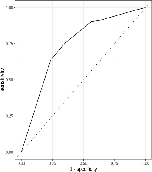
7. ROC Curve (Receiver Operating Characteristic Curve)
- Description: ROC curves are used to evaluate the performance of classification models, showing the trade-off between sensitivity and specificity.
R Code Example:
library(pROC)
# Simulated data
actual <- c(1, 1, 0, 1, 0, 0, 1, 1, 0, 1)
predicted_probs <- c(0.8, 0.7, 0.1, 0.9, 0.4, 0.3, 0.9, 0.6, 0.2, 0.85)
# ROC curve
roc_curve <- roc(actual, predicted_probs) plot(roc_curve, col = “darkgreen”, main = “ROC Curve”)
Interpretation:
- The ROC curve illustrates how well the classification model The closer the curve is to the top-left corner, the better the model’s ability to distinguish between classes.
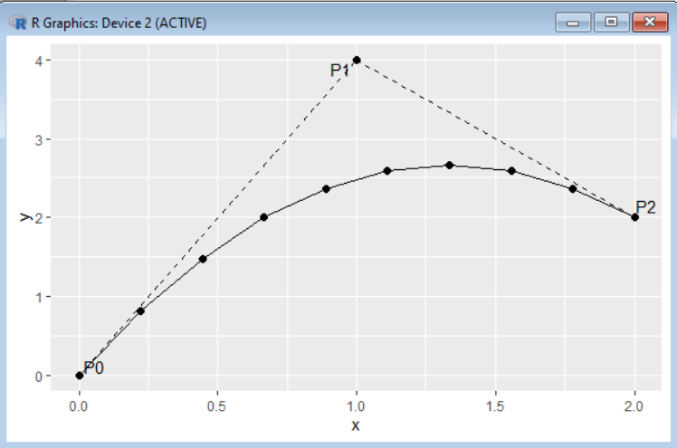
8. Bezier Curve
- Description: Bezier curves are used in computer graphics and animation for smooth curve
R Code Example:
# Using the Bezier package
library(bezier)
# Control points
control_points <- matrix(c(0, 0, 1, 2, 3, 3, 4, 0), ncol = 2, byrow = TRUE)
# Bezier curve
bezier_curve <- bezier(t = seq(0, 1, length.out = 100), p = control_points)
plot(bezier_curve[,1], bezier_curve[,2], type = “l”, col = “blue”, main = “Bezier Curve”, xlab = “x”, ylab = “y”)
Interpretation:
- Bezier curves are often used in design and animation to create smooth The control points determine the curve’s shape.
9. Spline Curves
- Description: Spline curves are smooth curves that pass through or near a set of control points. They are useful for smoothing noisy data.
R Code Example:
# Spline interpolation
x <- c(1, 3, 5, 7, 9)
y <- c(2, 3, 5, 7, 6)
spline_curve <- spline(x, y)
plot(x, y, main = “Spline Curve”, col = “red”, pch = 19)
lines(spline_curve, col = “blue”)
Interpretation:
- Spline curves can smooth out data or interpolate between points, creating a more natural- looking curve between known data points.

Use Case:
Suppose you are analyzing agricultural production data in India, where the growth of crop yield follows a logistic pattern due to seasonal effects and limited resources. You can use a logistic curve to model the relationship and understand the maximum yield a region can achieve.
These examples show the flexibility of R in generating different types of curves to visualize and analyze mathematical relationships, model behavior, or process data in various fields such as economics, biology, and computer graphics.