
Meritshot Tutorials
- Home
- »
- Scatter Plots in Tableau
Tableau Tutorial
-
Overview of TableauOverview of Tableau
-
Key Features and Benefits of TableauKey Features and Benefits of Tableau
-
Tableau Desktop vs. Tableau Online vs. Tableau ServerTableau Desktop vs. Tableau Online vs. Tableau Server
-
Navigating the Tableau InterfaceNavigating the Tableau Interface
-
Intro to Charts in TableauIntro to Charts in Tableau
-
Introduction to Calculated FieldsIntroduction to Calculated Fields
-
Common Calculations (e.g., Profit Margins, Growth Rates)Common Calculations (e.g., Profit Margins, Growth Rates)
-
Best Practices for Calculated FieldsBest Practices for Calculated Fields
-
Bar ChartBar Chart
-
Overview of Table CalculationsOverview of Table Calculations
-
Common Table Calculations (e.g., Running Total, Percent of Total)Common Table Calculations (e.g., Running Total, Percent of Total)
-
Customizing Table CalculationsCustomizing Table Calculations
-
Line ChartLine Chart
-
Aggregations in TableauAggregations in Tableau
-
Best Practices for AggregationBest Practices for Aggregation
-
Pie ChartPie Chart
-
Granularity in TableauGranularity in Tableau
-
Adjusting Granularity in Your VisualizationsAdjusting Granularity in Your Visualizations
-
Examples of Granularity in Different ScenariosExamples of Granularity in Different Scenarios
-
Scatter Plots in TableauScatter Plots in Tableau
-
Level of Detail (LOD) ExpressionsLevel of Detail (LOD) Expressions
-
Different Types of LOD Expressions (Fixed, Include, Exclude)Different Types of LOD Expressions (Fixed, Include, Exclude)
-
Practical Use Cases and ExamplesPractical Use Cases and Examples
-
HistogramsHistograms
-
Customizing Charts (Colors, Labels, Axes)Customizing Charts (Colors, Labels, Axes)
-
Introduction to Geographic DataIntroduction to Geographic Data
-
Creating and Refreshing Extracts in TableauCreating and Refreshing Extracts in Tableau
-
Benefits of Using Extracts vs. Live ConnectionsBenefits of Using Extracts vs. Live Connections
-
Creating Basic MapsCreating Basic Maps
-
Creating Interactive Filters (Dropdowns, Sliders)Creating Interactive Filters (Dropdowns, Sliders)
-
Using Filter Actions in DashboardsUsing Filter Actions in Dashboards
-
Customizing Maps (Layers, Annotations, Map Styles)Customizing Maps (Layers, Annotations, Map Styles)
-
Introduction to DashboardsIntroduction to Dashboards
-
Designing and Building DashboardsDesigning and Building Dashboards
-
Adding Interactivity (Actions, Filters)Adding Interactivity (Actions, Filters)
-
Using Map FiltersUsing Map Filters
-
Creating a Tableau StoryCreating a Tableau Story
-
Designing Storyboards for Effective CommunicationDesigning Storyboards for Effective Communication
-
Formatting in TableauFormatting in Tableau
-
Customizing Appearance (Colors, Borders, Fonts)Customizing Appearance (Colors, Borders, Fonts)
-
Best Practices for Dashboard FormattingBest Practices for Dashboard Formatting
-
Principles of Effective Data VisualizationPrinciples of Effective Data Visualization
-
Understanding Data Types and Data StructureUnderstanding Data Types and Data Structure
-
Choosing the Right Visualization for Your DataChoosing the Right Visualization for Your Data
-
Creating and Formatting ReportsCreating and Formatting Reports
-
Adding Filters and Parameters to ReportsAdding Filters and Parameters to Reports
-
Publishing and Sharing ReportsPublishing and Sharing Reports
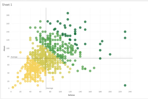
Scatter Plots in Tableau
Understanding Scatter Plots
A scatter plot visualizes the relationship between two numerical variables by plotting data points on a two-dimensional graph. Each point represents a pair of values—one from the x-axis (horizontal) and one from the y-axis (vertical). Scatter plots are particularly useful for identifying patterns, correlations, and outliers in data.
How to Read Scatter Plots
- Identify Axes: The x-axis typically represents the independent variable (e.g., time, temperature), while the y-axis represents the dependent variable (e.g., sales, scores).
- Examine Data Points: Look at the distribution of points to identify patterns or trends.
- Correlation Types:
- Positive Correlation: Points trend upwards from left to right, indicating that as one variable increases, so does the other.
- Negative Correlation: Points trend downwards from left to right, showing that as one variable increases, the other decreases.
- No Correlation: Points are scattered without any apparent trend.
What Type of Analysis Do Scatter Plots Support?
Scatter plots are ideal for:
- Identifying Relationships: Determine if a relationship exists between two variables.
- Analyzing Correlations: Discover if variables move together in a predictable way.
- Detecting Outliers: Spot any unusual data points that do not fit the general pattern.
When and How to Use Scatter Plots for Visual Analysis
Steps to Create a Scatter Plot:
- Connect to Data: Load a dataset that contains at least two numerical variables.
- Drag Fields to the View:
- Place one variable on the x-axis and another on the y-axis.
- Visualize:
- Observe the distribution of data points and look for patterns or correlations.
- Enhance:
- Add dimensions or filters to refine the analysis or highlight specific subsets of data.
Best Practices:
- Clear Axis Labels: Ensure that both axes are labeled clearly.
- Consistent Markers: Use uniform markers for data points.
- Avoid Clutter: Limit the number of data points if the plot becomes too crowded.
Common Mistakes:
- Overlapping Points: Can make the chart difficult to read. Consider using transparency or different markers.
- No Axis Labels: Makes it challenging to understand the variables being compared.
Frequently Asked Questions
Q: How can I determine the strength of a correlation in a scatter plot?
A: Look at how closely the data points follow a line or curve. The tighter the points cluster around a line, the stronger the correlation.
Q: What should I do if my scatter plot shows a lot of overlapping points?
A: Consider using different colors or shapes for different categories, or use transparency to make overlapping points more distinguishable.
Q: Can scatter plots be used for categorical data?
A: No, scatter plots are best suited for numerical data. For categorical data, consider using bar charts or pie charts.