
Meritshot Tutorials
- Home
- »
- Bar Chart in Tableau
Tableau Tutorial
-
Overview of TableauOverview of Tableau
-
Key Features and Benefits of TableauKey Features and Benefits of Tableau
-
Tableau Desktop vs. Tableau Online vs. Tableau ServerTableau Desktop vs. Tableau Online vs. Tableau Server
-
Navigating the Tableau InterfaceNavigating the Tableau Interface
-
Intro to Charts in TableauIntro to Charts in Tableau
-
Introduction to Calculated FieldsIntroduction to Calculated Fields
-
Common Calculations (e.g., Profit Margins, Growth Rates)Common Calculations (e.g., Profit Margins, Growth Rates)
-
Best Practices for Calculated FieldsBest Practices for Calculated Fields
-
Bar ChartBar Chart
-
Overview of Table CalculationsOverview of Table Calculations
-
Common Table Calculations (e.g., Running Total, Percent of Total)Common Table Calculations (e.g., Running Total, Percent of Total)
-
Customizing Table CalculationsCustomizing Table Calculations
-
Line ChartLine Chart
-
Aggregations in TableauAggregations in Tableau
-
Best Practices for AggregationBest Practices for Aggregation
-
Pie ChartPie Chart
-
Granularity in TableauGranularity in Tableau
-
Adjusting Granularity in Your VisualizationsAdjusting Granularity in Your Visualizations
-
Examples of Granularity in Different ScenariosExamples of Granularity in Different Scenarios
-
Scatter Plots in TableauScatter Plots in Tableau
-
Level of Detail (LOD) ExpressionsLevel of Detail (LOD) Expressions
-
Different Types of LOD Expressions (Fixed, Include, Exclude)Different Types of LOD Expressions (Fixed, Include, Exclude)
-
Practical Use Cases and ExamplesPractical Use Cases and Examples
-
HistogramsHistograms
-
Customizing Charts (Colors, Labels, Axes)Customizing Charts (Colors, Labels, Axes)
-
Introduction to Geographic DataIntroduction to Geographic Data
-
Creating and Refreshing Extracts in TableauCreating and Refreshing Extracts in Tableau
-
Benefits of Using Extracts vs. Live ConnectionsBenefits of Using Extracts vs. Live Connections
-
Creating Basic MapsCreating Basic Maps
-
Creating Interactive Filters (Dropdowns, Sliders)Creating Interactive Filters (Dropdowns, Sliders)
-
Using Filter Actions in DashboardsUsing Filter Actions in Dashboards
-
Customizing Maps (Layers, Annotations, Map Styles)Customizing Maps (Layers, Annotations, Map Styles)
-
Introduction to DashboardsIntroduction to Dashboards
-
Designing and Building DashboardsDesigning and Building Dashboards
-
Adding Interactivity (Actions, Filters)Adding Interactivity (Actions, Filters)
-
Using Map FiltersUsing Map Filters
-
Creating a Tableau StoryCreating a Tableau Story
-
Designing Storyboards for Effective CommunicationDesigning Storyboards for Effective Communication
-
Formatting in TableauFormatting in Tableau
-
Customizing Appearance (Colors, Borders, Fonts)Customizing Appearance (Colors, Borders, Fonts)
-
Best Practices for Dashboard FormattingBest Practices for Dashboard Formatting
-
Principles of Effective Data VisualizationPrinciples of Effective Data Visualization
-
Understanding Data Types and Data StructureUnderstanding Data Types and Data Structure
-
Choosing the Right Visualization for Your DataChoosing the Right Visualization for Your Data
-
Creating and Formatting ReportsCreating and Formatting Reports
-
Adding Filters and Parameters to ReportsAdding Filters and Parameters to Reports
-
Publishing and Sharing ReportsPublishing and Sharing Reports
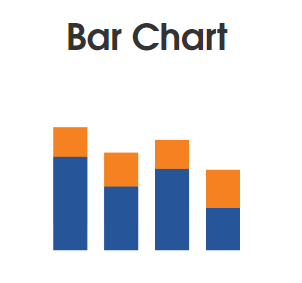
Bar Chart
What is a Bar Chart?
A bar chart is a graphical representation used to compare different categories or groups by displaying them as rectangular bars. The length or height of each bar represents the value of the category it represents. Bar charts are effective for comparing data across different categories, such as sales by product or revenue by department.
How to Read Bar Charts
To interpret a bar chart:
- Axis Labels: Identify what each axis represents (e.g., categories on the x-axis and values on the y-axis).
- Bar Length/Height: Compare the length or height of bars to understand the relative values.
- Baseline: Ensure the chart starts at zero to avoid misleading impressions.
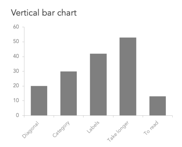
Types of Bar Charts:
- Vertical Bar Chart: Bars are plotted vertically.
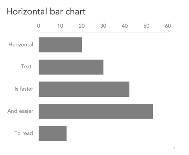
- Horizontal Bar Chart: Bars are plotted horizontally, useful for long category names.
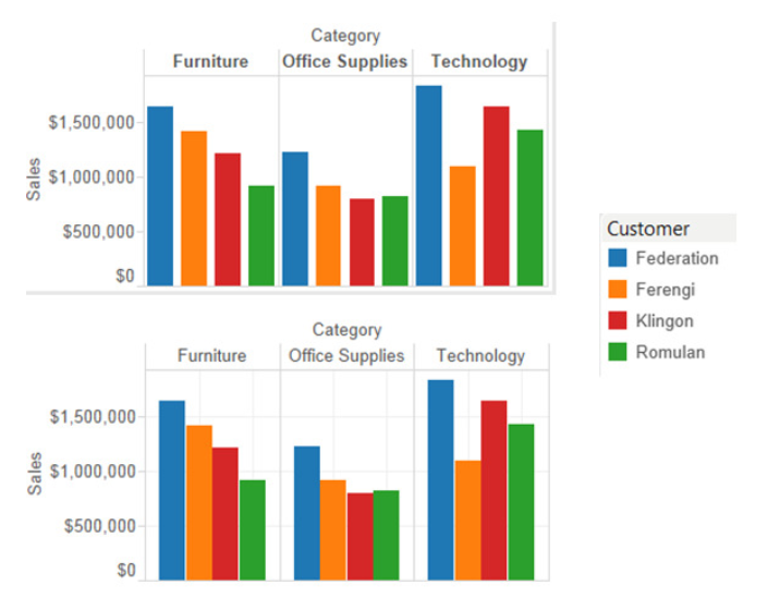
- Grouped Bar Chart: Compares subcategories within each main category.
Space
How to Read Bar Charts
Grouped Bar Chart
What Type of Analysis Do Bar Charts Support?
Bar charts are ideal for:
- Comparing categories: Highlight differences between various groups.
- Displaying changes over time: Use bars for different time periods.
- Analyzing subcomponents: Stack bars to show contributions of different elements.
Space for Image: Example of a bar chart analyzing sales data.
When and How to Use Bar Charts for Visual Analysis
Best Practices:
- Start Axis at Zero: Ensures accurate representation.
- Clear Labels: Label axes for better understanding.
- Consistent Colors: Use distinct colors for different categories.
- Avoid Clutter: Limit the number of bars for clarity.
Common Mistakes:
- Inconsistent Bar Widths: Can distort data comparison.
- Too Many Bars: Makes the chart difficult to read.
- Unlabeled Axes: Leads to confusion about data representation.
Steps to Create a Bar Chart:
- Connect to Data:
- Open Tableau and connect to your data source. For example, you might have sales data categorized by product.
- Drag Fields to the View:
- Drag the Category field to the Columns shelf.
- Drag the Sales field to the Rows shelf.
- Customize the Chart:
- Tableau automatically creates a bar chart when you add these fields. You can customize it by:
- Changing colors: Drag a field, such as Region, to the Color option on the Marks card.
- Sorting: Click on the sort icons in the toolbar to arrange the bars in ascending or descending order.
- Tableau automatically creates a bar chart when you add these fields. You can customize it by:
FAQs for Bar Charts
Q: What should I do if I have too many categories to display in a bar chart?
A: Consider using a grouped or stacked bar chart to organize subcategories, or filter the data to show only the most relevant categories.
Q: How can I make sure my bar chart is not misleading?
A: Always start the y-axis at zero and avoid distorting bar lengths. Provide clear axis labels and legends.
Q: Can I use bar charts for time series data?
A: Yes, bar charts can be used to show changes over time, though line charts might be better suited for continuous time series.