
.png)


Select the Program Designed
for Your Career Goals
Upskill with the Hottest Technologies of Future.
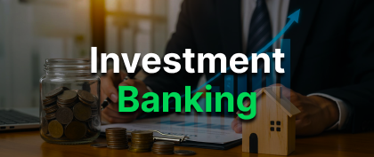

Investment Banking
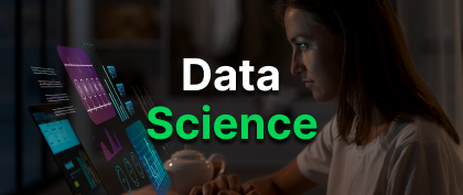
Data Science
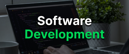
FSD with GEN AI

Cyber Security with Gen Al
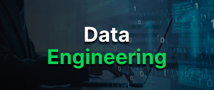
Data Engineering

Business Analytics
Learn from the Best in the Industry
Our instructors are experienced professionals from top global companies, bringing real-world expertise straight to your learning journey.

Data Scientist
Software engineering professional with PwC and Amazon experience. Specializes in building scalable applications, debugging, and enhancing performance efficiency.
Founder & CEO
8 years of software engineering across industries. Passionate mentor bridging theory with real-world application to prepare learners for high-impact careers.
ML Engineer
5+ years in AI and Data Science with focus on NLP, LLMs, and generative AI. Built scalable AI-driven products, combining technical depth with real-world problem-solving.
Data Scientist
6+ years in data science and scalable system design. Former Deloitte developer with expertise in system integration, analytics, and performance optimization.
Senior Associate
10+ years across IB and consulting with 11 years of teaching. Translates boardroom strategies into classroom clarity, preparing learners with deal-ready skills.
Deputy Manager
Chartered Accountant with 5+ years in audit, assurance, and financial advisory. Simplifies complex financial concepts into practical insights for aspiring finance professionals.
Cybersecurity
6+ years in cybersecurity specializing in threat detection, risk assessment, and cloud security. Works on incident response and compliance with global standards.
Software Development Engineer
5 years of experience at IBM and Microsoft, building enterprise applications and high-performance tools. Skilled in software design, optimization, and innovative solutions.
Security Engineer
4 years in network security, threat analysis, and incident response. Builds proactive defense strategies that enhance enterprise resilience and digital safety.
Threat Intelligence Analyst
5 years in threat hunting, malware analysis, and cyber defense. Focuses on identifying advanced threats and improving enterprise detection capabilities.
Investment Banker
10+ years in investment banking, specializing in high-value financial solutions and complex transactions. Former Cognizant analyst with expertise in analytics and process optimization.
Software Development Engineer
5 years of experience at IBM and Microsoft, building enterprise applications and high-performance tools. Skilled in software design, optimization, and innovative solutions.
Your Career Growth Roadmap
A proven 4-step path to take you from upskilling to your dream job
Stand out with a sharp resume, optimized LinkedIn/GitHub, and a strong
personal brand.
Learn industry-relevant skills through real projects, updated curriculum,
and hands-on practice.
Access hiring partners, alumni referrals, and salary negotiation guidance
to land top offers.
Ace every round with 1:1 mock interviews, role-specific training, and
actionable feedback.


The Meritshot Advantage
A learning ecosystem designed for real-world impact.
Built with industry experts, practical training, and end-to-end career support.

.png)
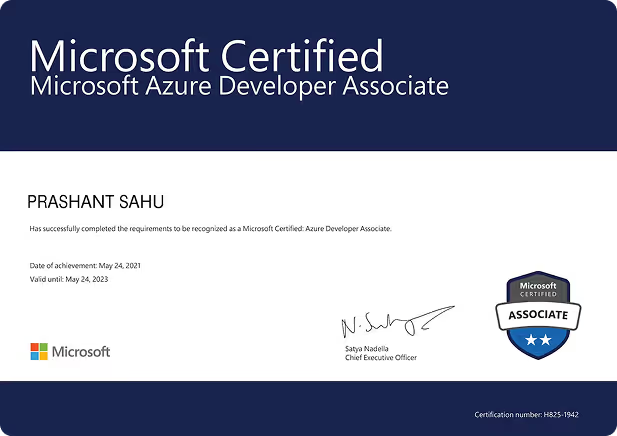
Microsoft-Accredited Program
Earn a globally recognized Microsoft certification to boost your resume and impress top product-company recruiters.

.png)
360° Career Support
From technical skills to salary negotiation — we guide you every step, with 200+ recruiter connections.


Practical Interview Prep
Practice with projects, case studies, and coding assignments — all with expert feedback for faster, better results.


Mentorship from Top Engineers
Learn 1:1 from MAANG and top product-company engineers with proven hiring insights.


Industry-Aligned Curriculum
Learn with constantly updated, job-ready modules designed to match industry trends and the evolving demands of top companies.


Small batch, big results
Earn a globally recognized Microsoft certification to boost your resume and impress top product-company recruiters.
What Learners Say
About Us?
Here are some steps you can take to accelerate
your career in the technology industry
After a decade in data, I kept missing big tech offers. Meritshot’s real-world projects and constant feedback sharpened my thinking and interview skills — I cracked Google with multiple offers.
9 yrs | IBM → Google
Stuck in repetitive analytics work, my portfolio didn’t stand out. Meritshot made me work on messy datasets and defend my solutions. That’s how I landed at Microsoft doing work I love.
7 yrs | Infosys → Microsoft
I thought learning new stacks was enough, but the real gap was application. Meritshot’s challenges and mentorship taught me to dig deeper. Today, I lead high-impact projects at Deloitte.
8 yrs | Wipro → Deloitte
Coming from accounting background, IB felt out of reach. Meritshot taught me the technicals and the unwritten rules of banking. Now at Goldman Sachs, I walk into meetings with confidence.
3 yrs | Goldman Sachs
I lacked deal experience and pitch skills. Meritshot had me create real valuation models and pitch to ex-bankers. Within months, I cracked EY and now thrive in IB.
4 yrs | Mid-Tier Bank → EY
Initially, I worked with small banks. Meritshot immersed me in IB-style work from deal structuring to market analysis, and pushed me to think with both speed and precision.
6 yrs | Barclays
After 7 years at TCS, I felt stuck. Meritshot’s step-by-step guidance and interview prep landed me Google with a 120% hike and multiple job offers.
7 yrs | TCS → Google
I was earning okay at Wipro but growth had stalled. Meritshot’s mock interviews exposed my weak answers. Three months later, I joined Amazon with a 150% hike.
5 yrs | Wipro → Amazon
My pay and exposure at Infosys didn’t match my effort. Meritshot’s mentors refined my answers and boosted my communication. In 2 months, I cracked Microsoft with a 210% hike.
4 yrs | Infosys → Microsoft
I failed 6 big tech interviews before Meritshot. Their mock panels fixed my answer structure, and in 3 months I had an offer from Meta with a 300% hike.
6 yrs | Capgemini → Meta
After years at HCL, I wanted more impact. Meritshot rebuilt my resume, fine-tuned my skills, and prepared me for behavioural rounds. I’m now at Netflix with a 250% hike.
8 yrs | HCL → Netflix
My growth at Cognizant was slow. At Meritshot, every mock interview came with brutally honest feedback, and that’s exactly what I needed. They refined my technical skills, comms, and built my confidence for high-pressure interviews.
5 yrs | Cognizant → Adobe
Microsoft Accredited Certificates
Earn globally recognized certificates that validate your skills and boosts your career prospects
Get Microsoft-backed certificates trusted by recruiters.
Certificates backed by projects & mentors — not theory
Achievements instantly verifiable, globally accepted

Ready to Level Up Your Career?
Join professionals who’ve launched their careers with Meritshot. Gain job-ready skills and step into high-demand roles today!
Learn while working
FAANG professionals
Microsoft accredited
Guaranteed assistance

Our Hiring Partners
World-class companies and fast-growing startups that hire our trained professionals for impactful roles across technology and digital innovation.


Tutorials & Learning Hub
A collection of focused, easy-to-follow tutorials that help you grow your skills one solid step at a time.


Body Language
Body language that speaks confidence
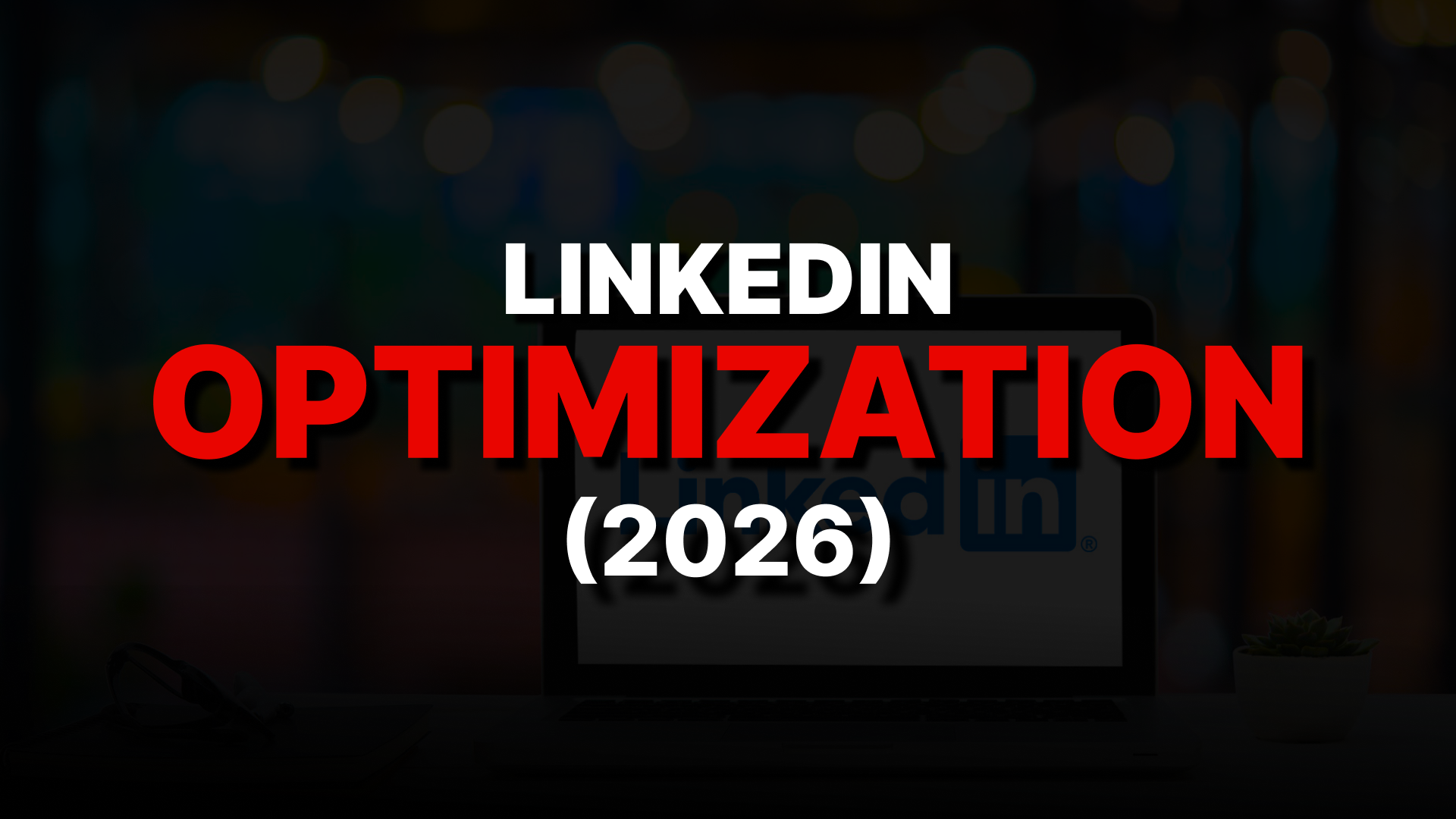
Linkedin Optimization
LinkedIn profiles that get noticed
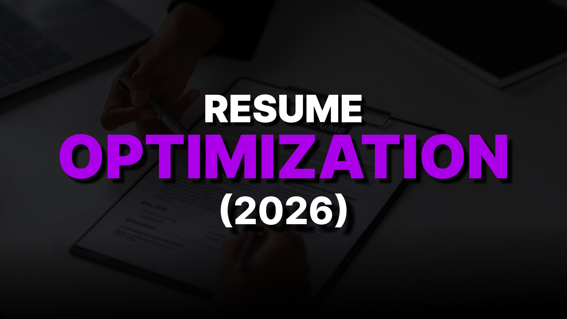
Resume Optimization
Build an ATS-ready resume that gets shortlisted
Our Resources
Everything here is built to support real learning, practical growth, and career readiness.


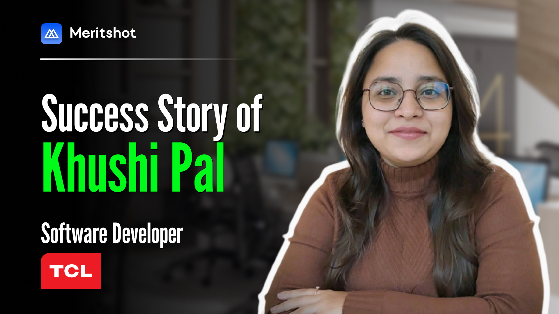
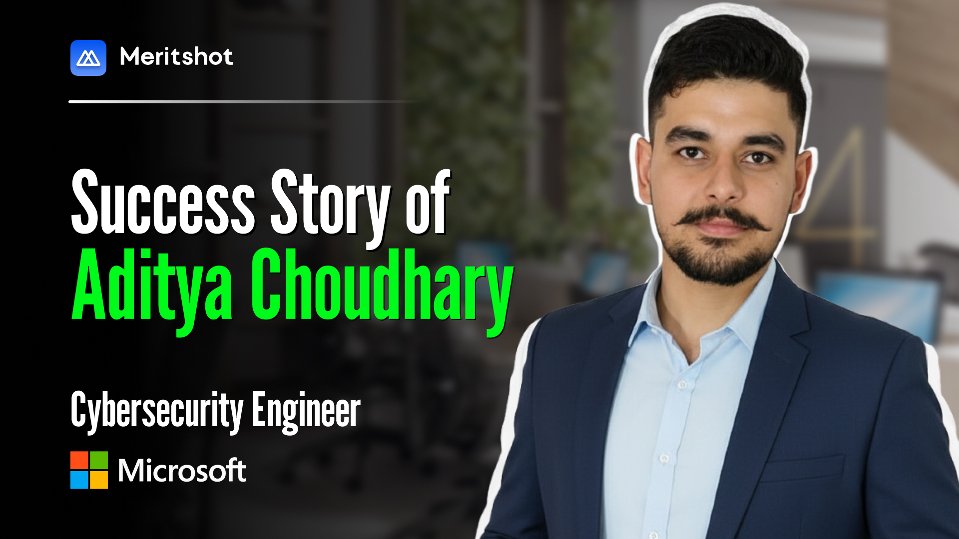
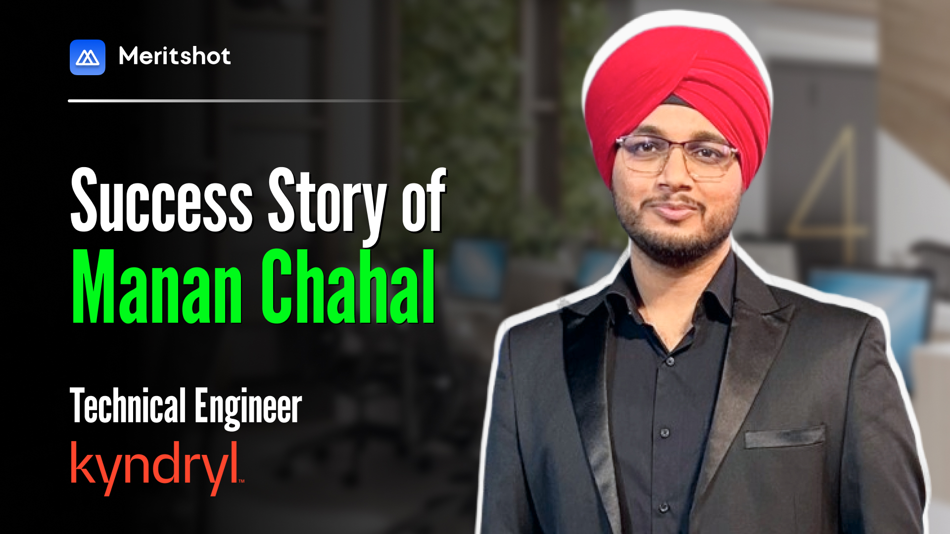
Hear from Meritshot’s Alumni at Top Companies
No filters. No fake promises. Just real transformations.
Meritshot changes lives through skills that matter.


.svg)
.png)

%204.png)