
Meritshot Tutorials
- Home
- »
- Histograms in Tableau
Tableau Tutorial
-
Overview of TableauOverview of Tableau
-
Key Features and Benefits of TableauKey Features and Benefits of Tableau
-
Tableau Desktop vs. Tableau Online vs. Tableau ServerTableau Desktop vs. Tableau Online vs. Tableau Server
-
Navigating the Tableau InterfaceNavigating the Tableau Interface
-
Intro to Charts in TableauIntro to Charts in Tableau
-
Introduction to Calculated FieldsIntroduction to Calculated Fields
-
Common Calculations (e.g., Profit Margins, Growth Rates)Common Calculations (e.g., Profit Margins, Growth Rates)
-
Best Practices for Calculated FieldsBest Practices for Calculated Fields
-
Bar ChartBar Chart
-
Overview of Table CalculationsOverview of Table Calculations
-
Common Table Calculations (e.g., Running Total, Percent of Total)Common Table Calculations (e.g., Running Total, Percent of Total)
-
Customizing Table CalculationsCustomizing Table Calculations
-
Line ChartLine Chart
-
Aggregations in TableauAggregations in Tableau
-
Best Practices for AggregationBest Practices for Aggregation
-
Pie ChartPie Chart
-
Granularity in TableauGranularity in Tableau
-
Adjusting Granularity in Your VisualizationsAdjusting Granularity in Your Visualizations
-
Examples of Granularity in Different ScenariosExamples of Granularity in Different Scenarios
-
Scatter Plots in TableauScatter Plots in Tableau
-
Level of Detail (LOD) ExpressionsLevel of Detail (LOD) Expressions
-
Different Types of LOD Expressions (Fixed, Include, Exclude)Different Types of LOD Expressions (Fixed, Include, Exclude)
-
Practical Use Cases and ExamplesPractical Use Cases and Examples
-
HistogramsHistograms
-
Customizing Charts (Colors, Labels, Axes)Customizing Charts (Colors, Labels, Axes)
Histograms
Understanding Histograms
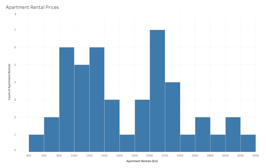
Histograms display the distribution of numerical data by grouping values into bins or intervals. Each bin represents a range of values, and the height of the bar corresponds to the number of data points within that range. Histograms are useful for visualizing the frequency distribution and identifying patterns such as skewness or modality.
How to Read Histograms
- Identify Bins: The x-axis represents the bins or intervals, and the y-axis shows the frequency of data points within each bin.
- Examine Distribution:
- Skewness: Determine if the data is skewed to the left or right.
- Modality: Look for peaks in the histogram to identify modes.
- Spread: Analyze how spread out the data is across bins.
Space for Image: Illustrate different distributions: normal, bimodal, skewed.
What Type of Analysis Do Histograms Support?
Histograms are effective for:
- Understanding Data Distribution: Visualize how data values are spread out.
- Identifying Patterns: Recognize patterns such as skewness or clusters.
- Statistical Analysis: Useful for performing statistical assessments like finding the mean and median.
When and How to Use Histograms for Visual Analysis
Steps to Create a Histogram:
- Connect to Data: Use a dataset with a continuous numerical variable.
- Define Bins: Determine the range and size of bins for grouping data.
- Plot Bars: Create bars for each bin to represent the frequency of data points within each range.
- Analyze: Look at the distribution to understand data trends and patterns.
Best Practices:
- Set Appropriate Bin Width: Choose bin width that balances detail and readability.
- Use a Consistent Color: For clarity and focus.
- Label Axes Clearly: Ensure that both axes are properly labeled.
Common Mistakes:
- Too Few Bins: May oversimplify the data.
- Too Many Bins: Can make the histogram cluttered and hard to interpret.
- No Axis Labels: Makes it difficult to understand the distribution.
Frequently Asked Questions
Q: How do I choose the right bin size for a histogram?
A: Choose a bin size that provides a balance between detail and readability. A common approach is to use the square root of the number of data points for the number of bins.
Q: Can histograms be used for categorical data?
A: No, histograms are designed for continuous numerical data. For categorical data, use bar charts.
Q: What should I do if my histogram looks skewed?
A: Analyze the data to understand the cause of the skew. You might need to adjust bin sizes or further investigate underlying factors influencing the distribution.